
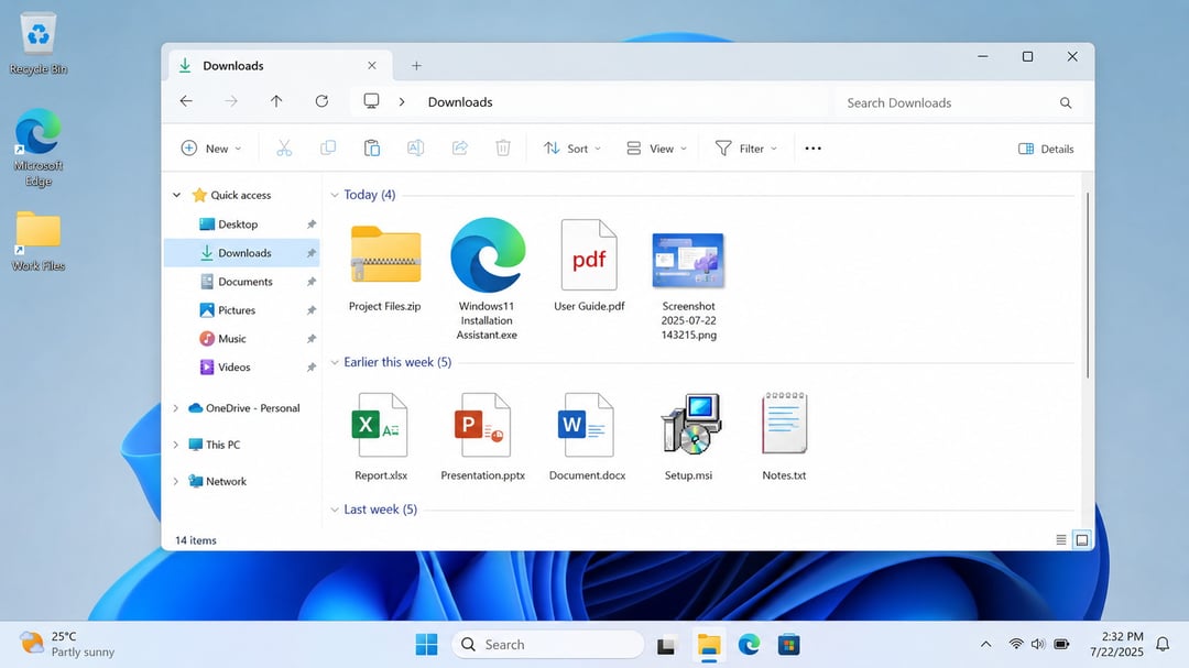
Right-click a file in Windows 11, hit Properties, and you're looking at a dialog box that hasn't meaningfully changed in decades. It's the kind of thing you stop noticing after a while — until you open it next to a freshly redesigned part of the operating system and the gap becomes impossible to unsee. That gap may finally be closing.
The hidden Properties window buried in a preview build
The first real evidence turned up in the latest Windows 11 preview builds, where a modernized File Properties window has been found sitting unannounced in the code. It was spotted by Phantomofearth on Bluesky, and the way to surface it is oddly specific: it shows up when you open properties on a file inside the Recycle Bin.
That's the only version discovered so far. But a single modernized dialog rarely arrives on its own. The far more likely read is that Microsoft is rebuilding the entire File Properties experience and this particular window just happened to land in a preview build ahead of the rest.
Nothing has been formally announced. The work exists, it's hidden, and it's clearly not finished.
Why File Explorer currently feels like two apps stitched together
Microsoft has been chipping away at File Explorer's design for years, and the results have been genuinely uneven. Certain areas got the full WinUI 3 treatment:
- The top section of the app
- The Home page
- The details pane
Everything else stayed where it was. So what you get today is a single application running two different design eras at once — modern surfaces up top, legacy dialogs underneath. Click deep enough into any workflow and you'll eventually hit a window that looks like it wandered in from a much older version of Windows.
The dark mode problem
The visual mismatch isn't just cosmetic. Some of these older popups and windows don't support dark mode at all. If you run Windows 11 with a dark theme, that means a bright white dialog occasionally detonating in the middle of an otherwise dark desktop. It's a small thing that feels like a big thing, and it's one of the most common complaints leveled at Windows 11's interface.
Rebuilding these dialogs in WinUI addresses both issues at once. They start looking like the rest of the OS, and they finally respect the theme you picked.
How this connects to Microsoft's broader WinUI push
The Properties window isn't an isolated project. Earlier this year, Microsoft confirmed plans to bring WinUI to the Start menu along with in-box apps and experiences across the system. The stated goals were design consistency and better performance — the same two things a modernized Properties dialog would deliver.
Seen that way, this preview build discovery is less of a surprise and more of a checkpoint. The Windows Shell is being converted piece by piece, and File Explorer's oldest corners were always going to be on the list.
The performance argument, and Windows K2
There's a reasonable objection here: rewriting native dialogs in a newer UI framework has historically meant trading speed for looks. Microsoft has confirmed it's working on improving the performance of WinUI itself, which is the foundation of its confidence that moving more of the Shell to WinUI will actually make the overall experience faster rather than slower.
That work sits inside Windows K2, the company's ongoing effort aimed squarely at fixing Windows 11's biggest problems. Framing the Properties redesign as part of K2 rather than a standalone visual refresh matters, because it suggests the goal is a system that feels better to use, not just one that photographs well in a blog post.
The reaction: modernization is fine, feature loss isn't
Not everyone is celebrating, and the skepticism has a specific shape to it. The dominant concern isn't about aesthetics at all — it's about what gets quietly removed along the way.
The reference point people keep returning to is the Control Panel. When functionality migrated to the Settings app, a meaningful chunk of it simply didn't survive the trip. That history makes users wary of any announcement that starts with "we're modernizing." The worry is that File Properties, which is a genuinely dense and power-user-oriented dialog, gets simplified for a broad audience and loses capability in the process. The same complaint gets raised about the Microsoft 365 admin portal, where options that used to be a single click have been stripped from the interface and pushed into PowerShell.
There's a second, more practical fear: that a redesign adds clicks. More screens, more nesting, more time to get to the one field you actually opened the window for.
But the counterargument holds up. If Microsoft finally updates dialogs that have gone untouched for years while keeping every option intact, that's a straightforward win. The redesign isn't the problem. The redesign as cover for feature removal is the problem. Those are two different outcomes, and the preview build doesn't yet tell us which one is coming.


