
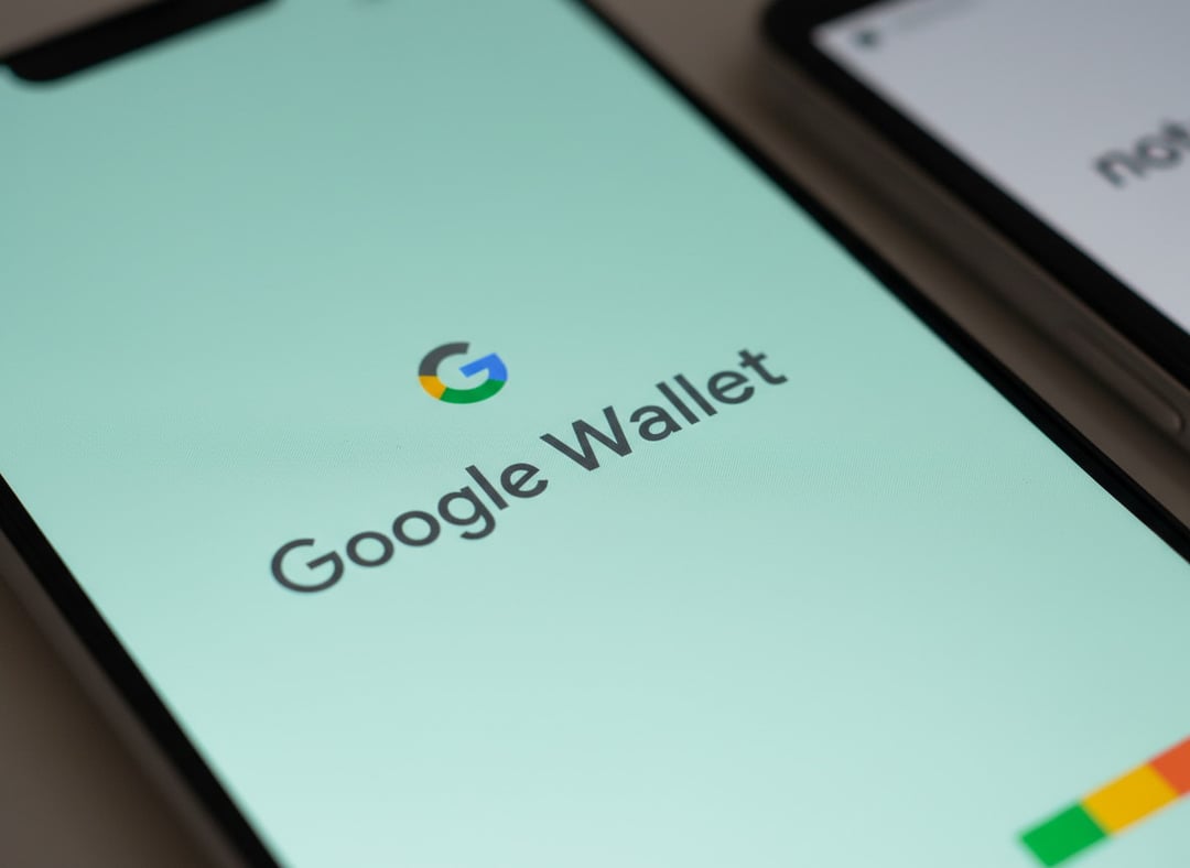
The Awkward Truth About Paying With Android
You've probably been there. You tap your Android phone at the register, and the clerk says, "Oh, you can use Apple Pay." And you stand there for a second, deciding whether it's worth explaining that what you're using is actually different — built on the same NFC technology, sure, but a whole separate platform with its own history and, honestly, its own long list of growing pains.
Most people just let it go. Because the reality is, Apple has always been better at marketing digital payments, even though Android had NFC tap-to-pay working years before Apple Pay launched in 2014. The original Google Wallet debuted back in 2011 — three full years earlier. But instead of building on that head start, Google spent the better part of a decade tripping over itself with rebrands, splits, merges, and enough identity crises to fill a case study in what not to do with a product.
That's starting to change. Google Wallet is in the middle of its biggest overhaul in years, and for the first time, it actually feels like something built with intention.
How Google Wallet Lost Its Way (and Spent Years Finding It)
Here's the short version of a genuinely confusing history.
The original Google Wallet (2011) was a genuine breakthrough. NFC payments on Android before retailers had even caught up. Then Google decided to split things apart — Android Pay handled your virtual payment cards, while a separate Google Wallet handled peer-to-peer transfers, kind of like a Google version of Venmo. Two apps, two purposes, zero clarity.
In 2018, they merged the two and rebranded everything as Google Pay (GPay). It briefly felt like the mess was over. Then 2020 happened. Somehow, there were two Google Pay apps on Android at the same time — one focused on paying friends and tracking rewards, another for mobile payments at the register. Two. Separate. Apps. Both called Google Pay.
The only silver lining was that pandemic-era lockdowns kept most people from going out and spending money anyway, so the confusion was slightly less infuriating in practice.
By 2022, Google Wallet finally became the single, unified contactless payment app for Android. GPay was officially retired. The name "Google Pay" stuck around, but it now refers to Google's broader online payment platform — not the tap-to-pay app. So at least there's that.
Live Flight Tracking: Small Feature, Big Signal
One of the most recent additions to Google Wallet is live flight tracking — and while the feature itself is relatively modest, it matters a lot because of what it says about where things are headed.
Wallet has stored boarding passes and airline loyalty cards for a while now. But if you needed to check your flight status while rushing to the gate, you'd have to jump out of Wallet and open the airline's app separately. Clunky. The kind of friction that pushes people back toward single-purpose airline apps just to avoid the switching.
On Android 16, Wallet solves this with Live Update notifications. Think of it like the Dynamic Island on iPhones — a persistent, glanceable progress bar that shows your flight status right on your lock screen and always-on display. You don't have to unlock your phone or open anything. It just shows you, even while you're moving between other apps.
It's a small thing. But it's the right kind of small thing — one that removes a real annoyance from a real moment people experience.
The Redesign That Actually Fixes the Daily Experience
The bigger story is the full Google Wallet redesign that's currently rolling out. It hasn't reached all devices yet — some users on Pixel 10 Pro have tried to force the update without success — but early looks confirm the changes are significant.
A Search Bar (Yes, Finally)
The old Wallet design relied on infinite scrolling. You'd swipe down through a long list of every card, pass, and ID you'd ever added, hoping the one you needed was somewhere in there. It worked, technically. But it was the digital equivalent of a junk drawer.
The redesign adds a search bar. Which sounds almost embarrassingly basic for an app made by the search engine company, but here we are — and it's genuinely welcome.
Two-Column Layout and Smarter Card Organization
Cards are now displayed in a two-column grid rather than a single endless list. They're organized by how often you use them and by type, so the things you tap most often float to the top naturally. You can also manually pin favorites so they're front and center whenever you open the app.
That's a real quality-of-life upgrade for something like a transit card, for example. If you've been defaulting to your debit card when tapping in and out of transit systems, you might be leaving pre-tax commuter benefits on the table without even realizing it. Being able to pin your transit card so it's always the default changes that.
Where Google Wallet Is Headed Next
The redesign and flight tracking are part of a broader push Google has been making for a few years now — turning Wallet into a genuine identity and access hub, not just a place to store payment cards.
Digital ID support has expanded significantly, with Wallet now able to store passports and driver's licenses that can be used at airport security. That groundwork is setting up a future feature called the Age Verification API, which will let you prove your age to an app or website simply by authenticating through Wallet — no handing over your full ID details unnecessarily.
And then there's Aliro 1.0, an emerging digital key standard that would let you walk through locked doors via contactless identification as you approach. No tapping, no pulling out your phone. Just proximity-based access using Wallet as your key.
Put it all together, and you start to see what Google is actually building here — not just a payment app, but a unified digital identity and access layer for your entire life. The payment cards were always just the entry point.