
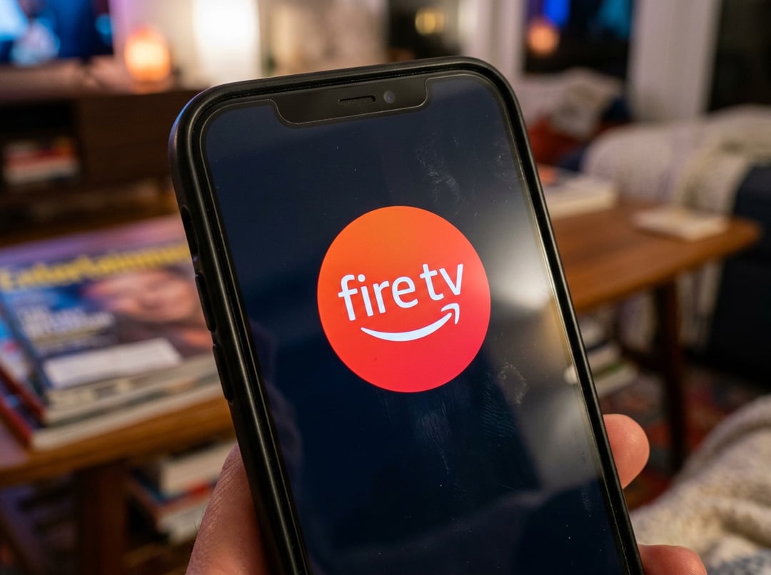
Redesigned Fire TV Mobile App: From Backup Remote to Content Discovery Hub
Amazon is rolling out a redesigned Fire TV mobile app that goes beyond being a simple “backup remote.” The updated Fire TV app is built to make your phone a true second screen—something you can use to browse and discover what to watch, manage a watchlist while you’re away, and start playing titles on your TV directly from the mobile app.
Instead of waiting until you’re on the couch to remember that show someone told you about, the new experience is meant to let you capture that recommendation in the moment—then have it ready on your Fire TV later. Amazon describes the goal as tighter “seamless integration between mobile and TV,” emphasizing speed and convenience for finding something to watch.
Browse and Discover Fire TV Content Directly on Your Phone
A key change is that the Fire TV app now supports content browsing and discovery on mobile. That’s a meaningful shift: rather than treating the phone as an accessory, Amazon is treating it as a place where viewing decisions actually happen.
This also reflects how people tend to behave now—scrolling on a phone while watching TV, looking up what’s trending, or checking what a service has before committing to opening it. The redesigned app leans into that reality by making the “what should we watch?” moment easier to handle from your smartphone.
Watchlist Management on the Go (Even Away From Home)
The updated Fire TV app also lets you manage your watchlist while you’re not at home. That matters because the decision-making part of streaming doesn’t only happen in front of the TV anymore. Recommendations show up in group chats, at work, or during a commute—and it’s easy to forget them by the time you’re back on your couch.
Amazon specifically positions this as a way to quickly add a friend’s recommendation, so your watchlist becomes more like a running capture tool—not something you only touch when the TV is on.
Play Titles on Your TV from the Fire TV Mobile App
The redesigned experience supports playing titles on your TV from the mobile app, turning the phone into a faster starting point for launching content. The underlying promise is simple: fewer steps between “I found something” and “it’s playing on the TV.”
In practice, this is Amazon pushing Fire TV further into the role of a streaming command center—where discovery and playback are tightly connected across devices.
Fire TV App Rollout Countries and Availability
Amazon says the redesigned Fire TV app is rolling out now in:
- United States
- Brazil
- Canada
- France
- Germany
- India
- Italy
- Japan
- Mexico
- Spain
- United Kingdom
This wide launch list signals the redesign isn’t a small experiment. Amazon is treating the updated app experience as a mainstream part of the Fire TV ecosystem.
How the New Fire TV Look Aligns With the Updated Fire TV User Interface
Amazon notes that the refreshed app design matches the new Fire TV user interface it launched recently—an interface intended to put more focus on content and simplify navigation.
The UI design updates include:
- Rounded corners
- Varied gradients
- Consistent typography
- More spacing between content
- More room for pinned apps
These details matter because they reveal what Amazon is optimizing for: scanning speed, clearer hierarchy, and less visual clutter while still putting content front and center. More spacing and consistent typography, in particular, tend to make a browsing-heavy experience feel less overwhelming—especially when users are jumping between rows of options.
Simplified Fire TV Navigation: Clear Category Icons and Easier Search
A big structural change is the simplified top navigation bar, now organized into icon-marked categories:
- Movies
- TV
- Live TV
- Sports
- News
On top of that, the search button is easier to access, positioned to the left of the Home tab. That small placement choice is a pretty loud signal: Amazon expects search to be a primary action, not a buried utility.
When you’re dealing with endless streaming catalogs, search becomes a shortcut past the noise. Making it more prominent is Amazon admitting what most viewers already feel—sometimes you don’t want to browse, you just want to get to something specific fast.
“For You” Rows: Surfacing What You’re Watching and What to Watch Next
Within the tabs, Fire TV surfaces:
- Content you’re already watching
- Recommendations from subscribed services
These are organized in rows labeled “For You.” The idea is to make the interface feel less like a grid of apps and more like a personalized feed—one that brings ongoing shows and suggested content into the same decision space.
The tabs also include:
- Free movies
- Top movies and shows
- Other paid content you might like
So the interface is mixing continuation (keep watching), personalization (recommendations), and discovery (free/top/paid suggestions) into a single browsing flow.
Why Amazon Is Redesigning Fire TV: Streaming Content Overload and Discovery
Amazon frames the redesign as a response to a real market shift: the surge of streaming content has made it harder to track what’s available across services. When every platform has more content than anyone can realistically browse, the pain point changes.
Fire TV can’t just be a place to launch apps anymore. It has to act like a discovery hub—something that helps you find what to watch across your subscriptions without making you mentally juggle which service has which show.
The redesigned Fire TV app and updated Fire TV user interface both point toward the same strategy:
- reduce friction in finding content
- keep users inside Fire TV’s discovery layer longer
- make “start watching” feel faster than “keep searching”
That’s the battle now. Not only who has the best catalog, but who helps you actually use it.